
Restaurant Marketing
How to highlight a specific product on your restaurant screens
An effective visual promotion isn't about showing many products, but about gradually directing attention to just one. Discover how to choose the right product, structure the information and build a coherent visual sequence around a single protagonist.
Not all products need the same prominence
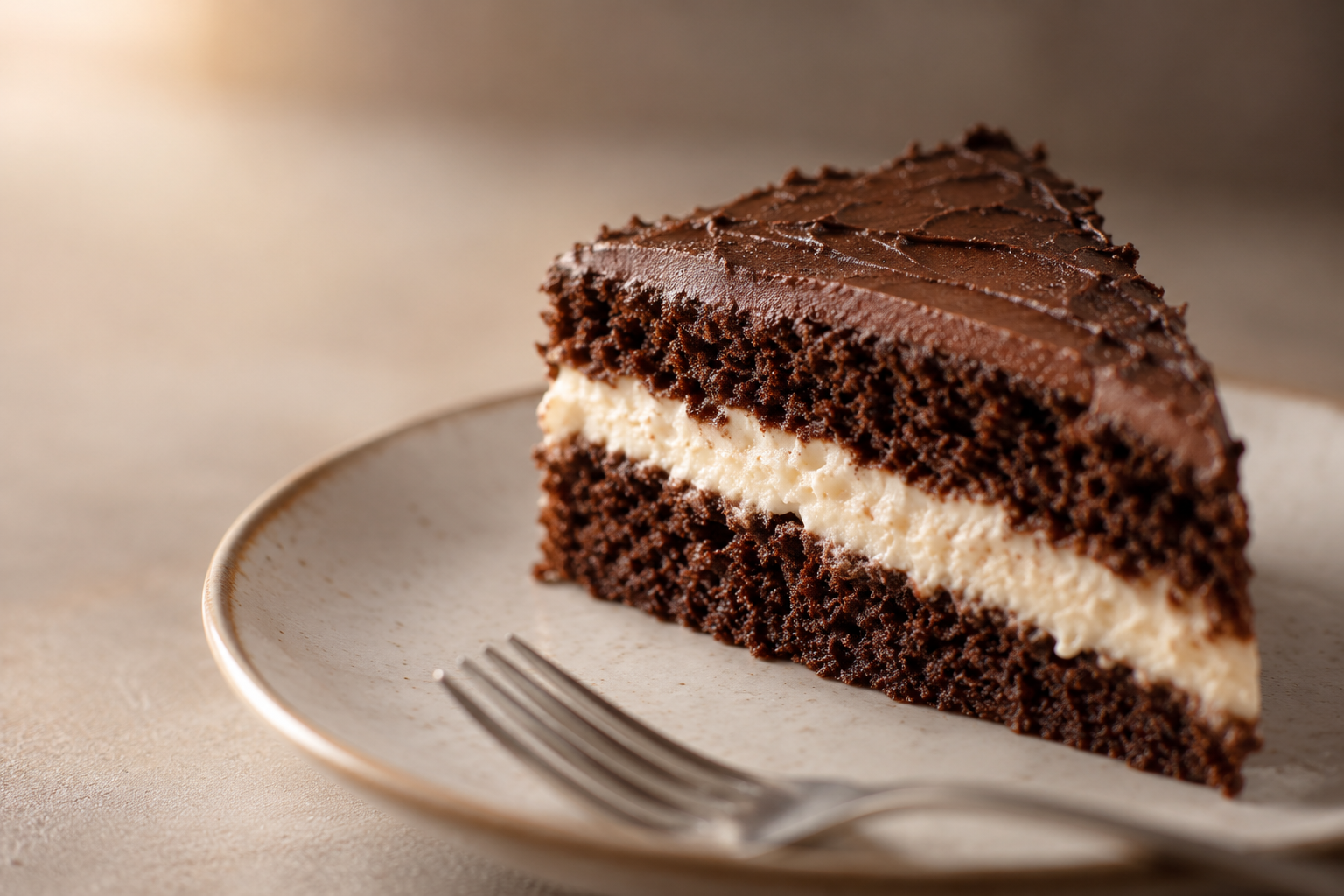
In a restaurant menu, all dishes share the same function: to inform what's available and at what price. That's fine for those who already know what they want, but it doesn't help guide the choice of someone who's still undecided. A visual promotion on screen has a different goal: it doesn't show the entire offer, but focuses on a specific product to make the decision easier. That difference changes the design: fewer elements, more hierarchy, and one main idea. Think of a screen showing six dishes at once; attention is split and none stands out. If instead you show a single chocolate cake with a creamy centre displayed large, with a brief message, the eye stops and desire awakens. It's not about ignoring the rest of the menu, but about deciding when a product deserves the spotlight.
Start with a single decision you want to trigger
Before opening a design tool, define which product you want to push. Not all products need the same boost at the same time: a new dish, a seasonal one, or one you particularly trust can be good candidates. The key is to reduce the promotion to a single decision. For example: 'I want more customers to order the chocolate cake with a creamy centre this week.' That concrete objective forces you to eliminate everything that doesn't help trigger that decision. If you try to promote two or three products at once, the screen becomes a mini menu and loses its power. Choose one, clear the message, and let the other products wait their turn in another campaign.
The product should dominate before the price
In a visual promotion, the order in which elements appear matters more than quantity. The product image should dominate the composition: large, with good lighting and a frame that makes it appetising. Then the product name and a brief, sensory description (without overdoing it) reinforce the proposition. The price, if you decide to show it, should not compete with the product on the first screen. Save it for a later moment, when the customer is already convinced they want that dessert. If the price appears before desire is created, it acts as a rational filter and can cool the impulse. In the case of the chocolate cake with a creamy centre, the ideal sequence starts with an appetising image, continues with a name and a brief idea of what makes it special, and only at the end, if necessary, invites to order or shows the price. That progression respects the natural hierarchy of attention: first see, then desire, then decide.
Demonstration: from a menu dessert to featured product
What should remain consistent across screens
Between one screen and the next, the promotion should feel like the same campaign, even if each slide has a different composition. That continuity is achieved by maintaining the same product, the same colour palette, the same typography, and a similar visual structure. There's no need to repeat exactly the same design; in fact, it's good to vary the angle, framing or text distribution so the sequence doesn't become monotonous. But the viewer should instantly recognise they're still seeing the same chocolate cake promotion. Continuity also affects the message: if on one screen you say 'creamy centre' and on the next you change the argument, you lose coherence. Keep the central idea and only change the way it's presented.
What often weakens a visual promotion
There are mistakes that are frequently repeated and weaken any visual promotion: - Too many products on one screen: attention is scattered and none stands out. - Excess text: the more they read, the less they look. Two or three lines are usually enough. - Premature or oversized price: if the price competes with the product image, the customer focuses on cost and not on desire. - Generic CTA: 'Click here' or 'Learn more' don't invite ordering a specific dessert. Better a direct call to the product. - Repetitive compositions: four identical screens bore and lose impact. Vary viewpoint without losing identity. Avoiding these mistakes is easier when you're clear that the goal is to highlight a single product and guide attention towards it.
Apply the same logic to your own screens
Once you understand the logic of visual promotion, the next step is to apply it to your own screens. Define a product, choose a brief message, prepare a sequence of three or four slides, and publish it in a visible location in the restaurant. With iMediaGO, you can create and publish visual campaigns for your screens without any design knowledge. The same structure we've reviewed (one product, one decision, a coherent sequence) can be materialised into a campaign ready to air. It's not about turning the whole venue into advertising, but about using the screens you already have to guide decisions at key moments, like dessert.
Create your own visual promotion
Turn a product from your menu into the star of your screens. Create and publish your first campaign with iMediaGO.