
Restaurant marketing
How to design an easy-to-read digital restaurant menu
A menu that works well on paper will not always work on a screen. The key is to select, divide and prioritise information so customers can quickly find the category, dish and price they are looking for.
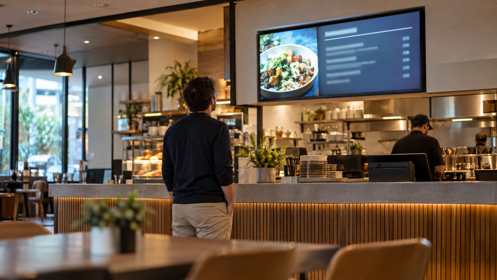
Why a menu designed for paper does not work the same way on a screen
A printed menu is viewed up close. Customers can move through the pages, pause at a category or go back whenever they need to. A screen creates a different situation: customers need to recognise the structure and find the relevant information without having the menu in their hands. Problems arise when the entire printed menu is squeezed onto a single screen. To make everything fit, dish names become smaller, prices are packed too closely together and the spaces that helped separate categories disappear. The screen may contain all the information and still be difficult to use. That is why designing a digital restaurant menu does not begin with choosing a typeface. It begins with deciding what actually needs to be visible at the same time. A screen does not have to reproduce every centimetre of the original menu. It needs to help customers quickly identify the category they want, the dishes within it and the price of each option.
Split the menu before reducing the text size
When a menu does not fit comfortably, the first instinct is often to make everything smaller. It is better to reverse that process: before shrinking the text, divide the information. One simple approach is to split the menu into categories customers already understand. In the example used in this article, three screens are enough to create three clear sections: Starters, Main courses and Desserts. Each screen can then focus on one part of the decision instead of competing to display the entire menu. This division also makes editing easier. When every screen has a clear purpose, it is simpler to see when a category has become too crowded and needs a different arrangement. The right amount of content is not determined by a universal number. It depends on the available space, the length of the dish names and the distance from which the screen will be viewed. The practical rule is simple: if adding one new dish means compressing the entire layout, the problem is probably not the font size but the amount of information you are trying to show at once.
Create a clear hierarchy for categories, dishes and prices
Once the content has been divided, each screen needs a repeatable hierarchy. Customers should be able to distinguish three levels almost immediately: which category they are viewing, which dishes are available and where to find their prices. The category acts as a point of orientation and should be clearly differentiated from the list itself. Dish names need enough visual presence to be scanned easily. Prices, meanwhile, should remain in a consistent position so customers do not have to search for each figure again. Alignment and spacing matter just as much as size. When prices move around, dishes are packed too closely together or every line uses a different structure, the menu takes more effort to read. A stable pattern allows customers to scan the menu visually instead of deciphering every element individually. It is also worth avoiding a layout in which every component competes for attention. If the category, dishes, prices, images and featured elements all carry the same visual weight, there is no clear reading path. Hierarchy is precisely about deciding what should be noticed first and what information should follow.
A practical layout: featured product on the left, menu on the right
One possible layout is to reserve part of the screen for a featured product and use the rest for the list of dishes. For example, the featured product can sit on the left while the menu for that category appears on the right. This separation gives the image or featured product its own space without placing it behind the text or interrupting the list. At the same time, the menu area can keep a regular structure for dish names and prices. It is not the only valid layout. Depending on the screen format, the number of dishes and the visual material available, the featured element could appear elsewhere or be omitted altogether. What matters is maintaining a functional separation: the element designed to attract attention should not make the menu harder to read. When this structure is used across several screens, it is worth keeping it consistent. If the featured area and the list occupy equivalent positions for Starters, Main courses and Desserts, customers quickly learn how the information is organised.
Example: a complete menu across three screens
Let us see how these principles work with an example restaurant menu. The information is divided across three horizontal screens, one for each category, while keeping the same composition principle throughout: one featured product and a short list of dishes with their prices. The first screen covers Starters and features Burrata with roasted tomatoes for €10.90. The list includes Ham croquettes for €7.90, House potato salad for €7.50, Patatas bravas for €6.90 and Crispy calamari for €9.50. The second screen is dedicated to Main courses. The featured item is the House burger for €13.90, while the menu lists Grilled chicken for €14.50, Vegetable rice for €13.50, Grilled salmon for €16.90 and Entrecôte with potatoes for €19.50. The third screen presents Desserts. Cheesecake, priced at €6.50, takes the featured position. The list is completed by Chocolate brownie for €6.00, Crema catalana for €5.50, Artisan ice cream for €5.00 and Seasonal fruit for €4.90. The value of the example is not in treating this arrangement as a mandatory template, but in seeing how dividing the menu by category avoids forcing the entire offering into a single composition.
What we can learn from the three screens
The example highlights several reusable principles. The first is that dividing the menu can improve clarity without sacrificing essential information. Each screen has an unambiguous category and a limited set of choices that customers can scan in an orderly way. The second is consistency. Keeping the same logic for the category, list, prices and featured product reduces unnecessary changes from one screen to the next. The content varies, but the way customers interpret it remains stable. The third is that featuring a product requires space. Adding a focal element should not mean placing more content on top of an already crowded menu. It is better to reserve a defined area for it while protecting the space needed to read the menu. Finally, readability should be assessed on the real screen, not only in the editor. A design that looks spacious from close up may behave differently once installed. Before considering it finished, it is worth checking whether categories, names and prices remain clearly distinguishable under the restaurant's normal viewing conditions.
How to keep the menu up to date without redesigning it every time
A good screen-based menu system should continue to work when the menu changes. If replacing one dish means rebuilding the entire composition, the design is too dependent on the specific content it was created with. The solution is to work with a stable structure. The category, dish area, price position and featured space can keep the same function while the names or products being shown change. Updating the content then becomes mainly a matter of replacing information within an established hierarchy. It also helps to apply consistent editing rules. A particularly long new dish name, for example, should not be handled simply by shrinking that one line until it becomes difficult to read. It is better to review the available space in the block, the wording or the overall distribution before breaking the visual consistency. Planning for updates from the start turns the digital menu into a reusable system rather than a piece that has to be redesigned every time the offering changes.
Create and publish your menu with iMediaGO
Once the structure has been defined, the next step is to bring it onto the restaurant's screens and keep it up to date. iMediaGO allows you to create, update and publish campaigns and digital menus on screens throughout the venue. The practical advantage of working with a structure like the one in this example is that content and organisation can remain separate: categories keep a recognisable logic while the dishes within them can be updated whenever necessary. The goal remains the same throughout the process: technology should not add complexity to the menu. It should make it easier to present information clearly and keep it current.
Example restaurant menu: three screens
Create and publish your digital menu
Organise your menu so it is easy to browse, then use iMediaGO to create, update and publish your digital menu on your restaurant screens.