
Design
How to make an on-screen menu easy to read
A menu can look perfectly clear up close and become difficult to understand from across the restaurant. Viewing distance, text size, contrast and hierarchy should guide every design decision.
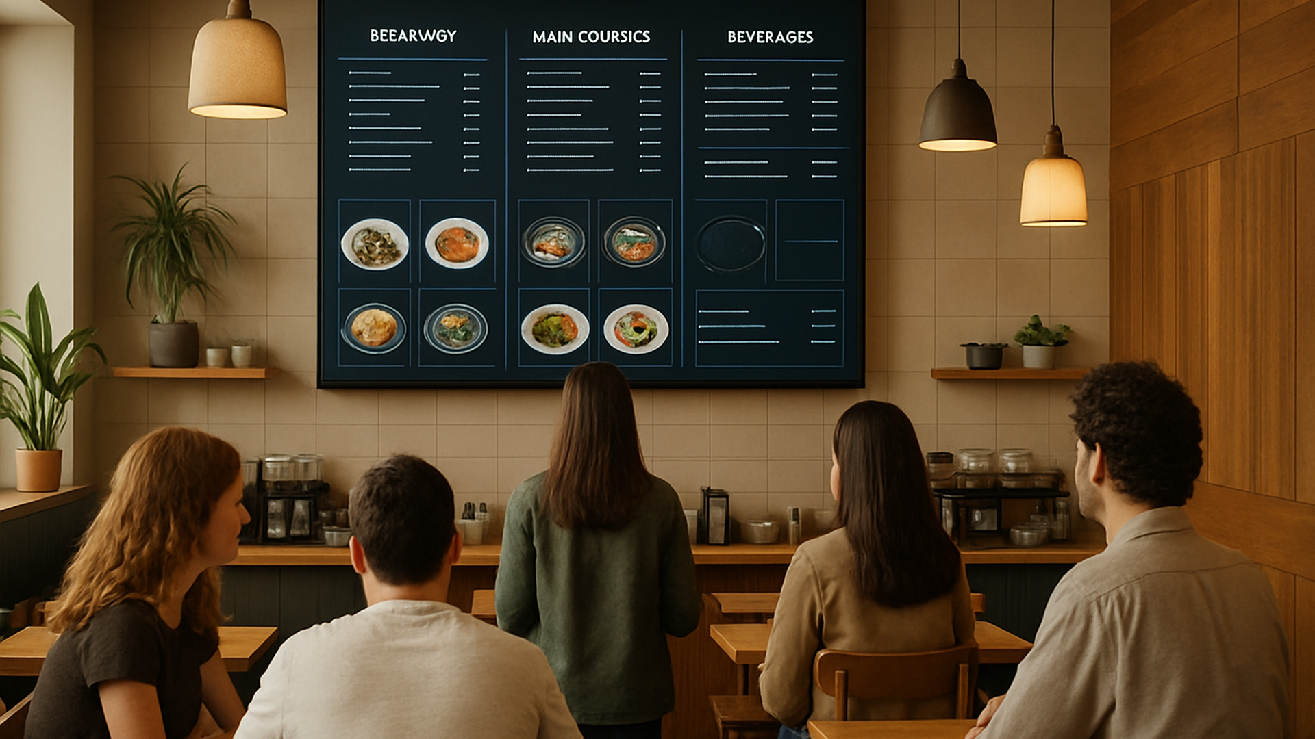
Distance changes the entire design
An on-screen menu is not read from the same distance as a printed menu or a phone. Customers may be standing several metres from the screen, so a layout that looks clear while you are designing it can become difficult to scan in the restaurant. Start with the real viewing distance: consider where customers will normally stand, what they need to identify first and how quickly the main information can be understood from that position.
Choose text size for the customer's real position
Do not judge text size only while looking at the design up close. The important test is whether the customer can comfortably distinguish the essential information from the normal viewing position. Give the most important elements more visual weight and avoid shrinking text simply to fit additional content. If information only works when someone approaches the screen, the menu needs to be simplified or reorganised.
Contrast makes information easier to find
Good contrast helps customers separate information quickly on a restaurant screen. Text and its background need enough visual separation to remain clear in the actual environment, while the hierarchy should make the order of information obvious. Keep decorative elements from competing with the menu itself. The goal is not to fill the screen, but to make the content customers need easy to locate and read.
What a readable daily menu board looks like
Keep the menu easy to scan
- Limit the number of visible products so individual choices remain easy to distinguish.
- Give prices a clear and consistent place in the information hierarchy.
- Make the most important information visually stronger than secondary details.
- Check the finished menu from the customer's real viewing distance before publishing.
Check readability before you publish
View the complete menu at its real screen size and from the distance where customers will normally read it. Design for that distance, then remove or reorganise anything that becomes difficult to understand.