Restaurants
How to Design an Easy-to-Read Digital Restaurant Menu
A digital restaurant menu should do more than reproduce a printed menu on a screen. It should help guests find dishes, navigate categories and check prices at a glance. Learn how to organize your menu, establish a clear visual hierarchy and test readability from the places where customers actually stand.

Why a digital restaurant menu needs a screen-first design
With a printed menu, guests can bring the page closer, turn it over and spend time reading the details. A menu displayed on a restaurant screen works differently. Customers may be standing several steps away, looking alongside other guests or trying to find a dish quickly.
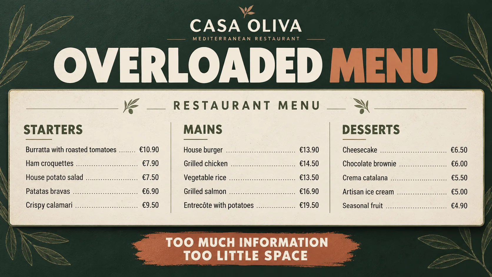
Shrinking the text until every item fits is rarely the answer. Crowded categories, long descriptions and poorly aligned prices make a menu harder to scan. Start by deciding how to group the information and give each section enough space.
A readable digital menu makes three things immediately understandable: which category the guest is viewing, what dishes are available and how much they cost. We will use the fictional CASA OLIVA restaurant to show how these principles work in practice.
Divide the menu before making the text smaller
Put readability first
Before adding more dishes, check whether existing names and prices are easy to distinguish. A complete menu is not helpful if guests struggle to read it.
Group dishes into categories
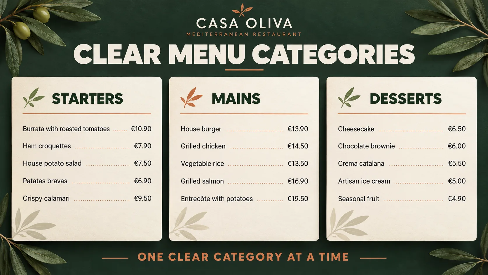
Use clear sections such as Starters, Mains and Desserts when they reflect the actual menu. Give each category a recognizable heading and consistent internal structure.
Reduce visual competition
Avoid making every dish name, photograph and price equally prominent. Help guests identify the section first, then scan its options without unnecessary distractions.
Adjust the layout
If a category becomes crowded, reorganize its content or try a different layout before reducing the text size.
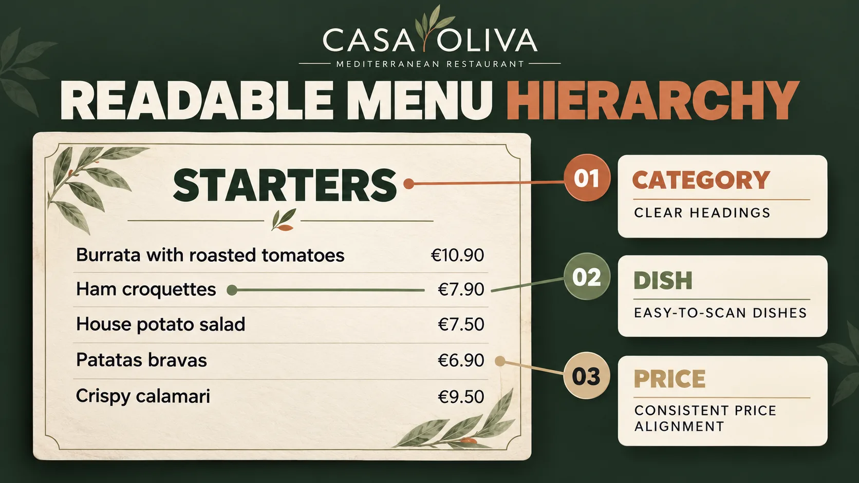
Build a clear hierarchy between categories, dishes and prices
Category: establish context
The category heading tells guests which part of the menu they are viewing. Distinguish it through size, typographic weight or placement.
Dish: make choices easy to scan
Make dish names easy to scan with legible lettering and sufficient spacing. Keep descriptions brief and include them only when they help guests understand their options.
Price: complete the information
Keep each price close to its dish and align prices consistently. Guests should be able to find the amount quickly without the price competing with the dish name.
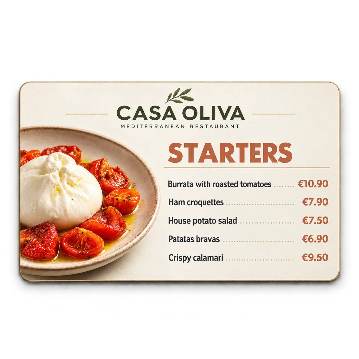
How to combine a featured dish image with a readable menu list
A digital menu can place a dish photograph in one area and a structured category list alongside it. This approach works when the image helps guests recognize an option without making the remaining dishes harder to read.
For CASA OLIVA, Burrata with Roasted Tomatoes can occupy the image area of the Starters menu. Ham Croquettes, House Russian Salad, Patatas Bravas and Crispy Calamari appear in an organized list with their prices. The photograph supports the menu rather than turning the entire section into a separate product promotion.
Use the same structure for Mains and Desserts, with consistent headings, spacing and price alignment. This is one possible layout, not a fixed template. If space is limited or dish names are long, a text-only menu may be easier to read.
A readable digital menu example: Starters, Mains and Desserts
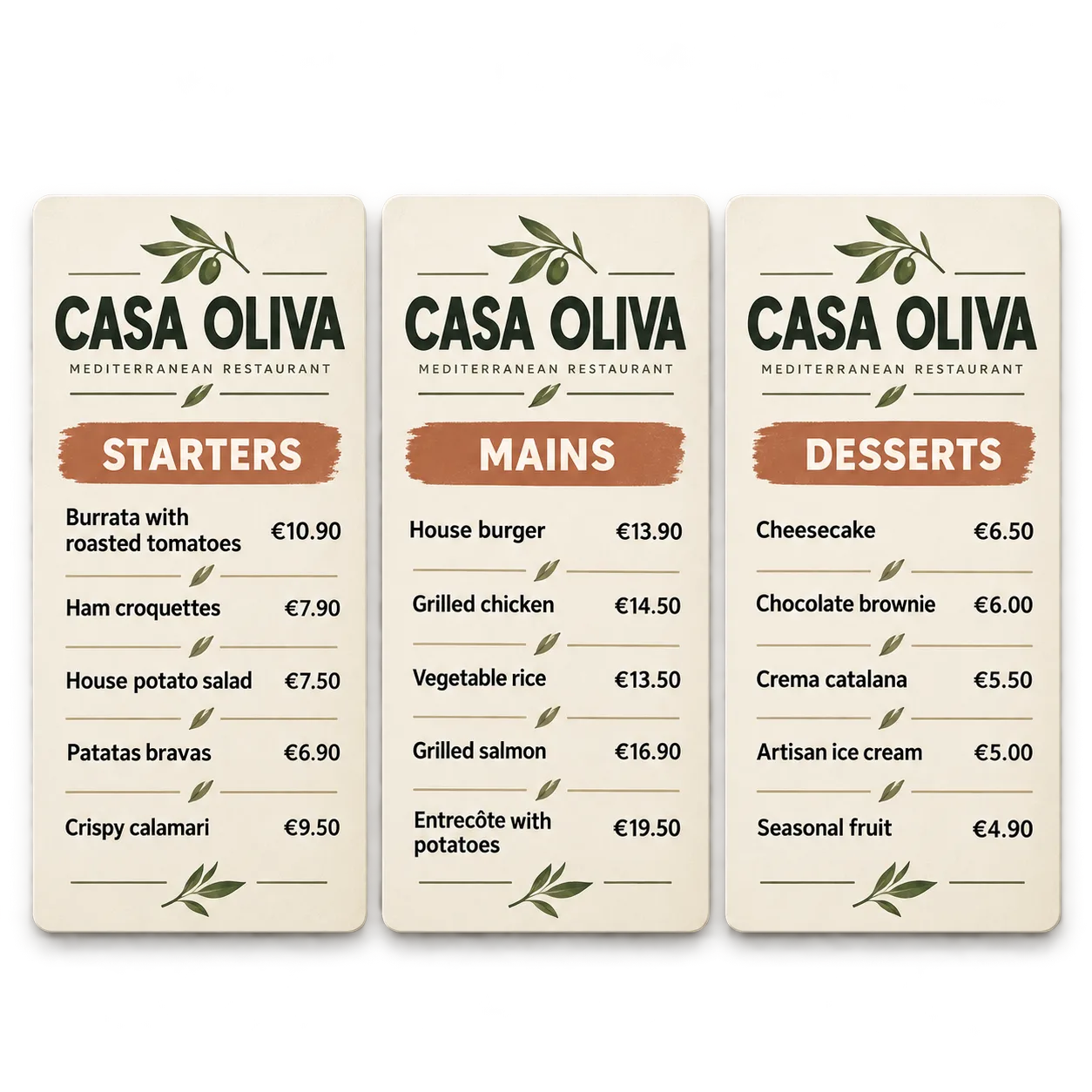
Imagine CASA OLIVA's menu divided into three layouts: one for Starters, one for Mains and one for Desserts. Each category has enough room to present its dishes without unnecessarily reducing text size.
Starters. Burrata with Roasted Tomatoes — €10.90; Ham Croquettes — €7.90; House Russian Salad — €7.50; Patatas Bravas — €6.90; Crispy Calamari — €9.50.
Mains. House Burger — €13.90; Grilled Chicken — €14.50; Vegetable Rice — €13.50; Grilled Salmon — €16.90; Steak with Fries — €19.50.
Desserts. Cheesecake — €6.50; Chocolate Brownie — €6.00; Crema Catalana — €5.50; Artisan Ice Cream — €5.00; Seasonal Fruit — €4.90.
Each layout follows the same reading pattern: a prominent category heading, an orderly list of dishes and consistently aligned prices. Burrata, the House Burger and Cheesecake can provide the visual reference for their respective sections without changing the menu's main purpose: making all available choices easy to consult.
Using three layouts is an editorial choice for this example, not a universal requirement. A shorter menu might fit comfortably into one composition, while a longer menu may need a different arrangement.
How to test whether your digital menu is readable at a distance
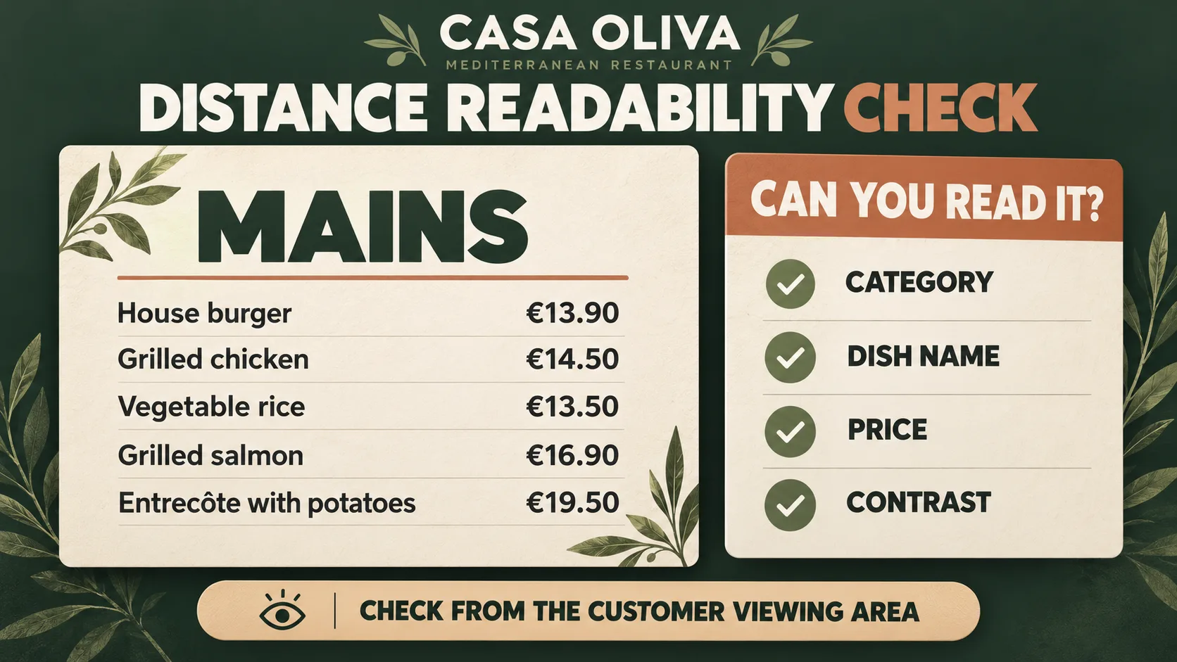
View it from the customer area
Check the menu from the places where guests will actually read it. A layout that looks clear on your design monitor may be difficult to follow from the ordering area or dining space.
Find a specific dish
Try locating a category, a dish and its price without repeatedly scanning the entire layout. If it takes too much effort, reconsider the order and spacing.
Check contrast and lettering
Check that letters and numbers remain easy to distinguish under the restaurant's usual lighting. Adjust contrast, font weight and spacing where needed.
Refine and test again
If the menu is difficult to read, shorten unnecessary text, rearrange elements or give important information more space. Test the revised layout again from the customer area.
Keep the menu structure consistent when dishes and prices change
A digital menu should not become harder to read every time a dish is added or a price changes. Keeping category headings, typography, spacing and alignment consistent helps guests recognize the same reading structure across the menu.
When adding a dish, check whether it fits comfortably into the existing layout. If the list becomes too dense, reorganize the content rather than compressing everything. When changing a price, make sure it remains visually associated with the correct dish and follows the same formatting as the other prices.
Consistency does not mean the design can never change. It means every update preserves a recognizable structure and is checked for readability.
A readable menu is only one part of a restaurant's screen communication. For other content ideas, explore what to show on restaurant screens.
When the goal changes from presenting the full menu to promoting one particular dish, see how to highlight a product on restaurant screens.
Aligning menu prices is different from choosing the leading element in a promotion. Explore that decision in product first or price first on restaurant screens.
If you are preparing your first restaurant screen, start with our beginner's guide to restaurant digital signage.
Once your menu layout is clear, discover iMediaGO's digital signage solution for restaurants.
Frequently asked questions about readable digital restaurant menus
Bring a clearer menu to your restaurant screens
A useful digital menu starts with a layout guests can read easily. Discover iMediaGO's solution for restaurants and explore how visual communication can fit into your establishment.
Latest articles
Where to Place Digital Signage Screens in a Leisure Centre
Digital Signage for Auto Repair Shops: What to Show at Reception, in Waiting Areas and at Vehicle Collection

Digital signage in education: clear communication for students and visitors
What to Show on Restaurant Screens: 4 Practical Ideas
Sunday Family Menu: How to Present an Offer Worth Sharing